magazine research (photostory)
- Henry Weekes

- Mar 29, 2021
- 6 min read
In preparation for my photo story I have decided to research and take inspiration from a selection of different action sports magazines. My project will be based around mountain biking and whilst I couldn't find many mountain bike specific magazines in WHSmiths I can use the techniques used in other magazines that cover similar sports to influence the style and layout of my own project.
The first magazine I picked up was a surfing magazine called 'carve', what I liked from this magazine was the how they have used the negative space as a natural place for the text to sit. I like how they paragraphs overplayed in a highlighted square over the image, I think this is an effective way of filling a page whilst still allowing the text to be clear. The next thing I noticed was the 3/4 page split of image to text, I liked that this gave the effect of a full double page spread whilst maintaining space for text. I also like that there is a portrait of the surfer at the bottom of the text. I also noticed the spacing they used for the text, I liked the way it sat with larger boarders and didn't stretch to the edges of the page. This created a nice balanced page which complimented the image next to it visually. Lastly I really liked the photo montage collage type page which was an advert for vans. I liked the way this page could tell a larger story due to the amount of photos on the page whilst clearly showing the subject larger, taking up just over half of the page to the left of it.


The next magazine I looked at was 'windsurf' the reason I chose to look at this was due to the design of the magazine. Firstly the font and text on the cover naturally match up to the colours and image, I like the way it feels like a poster rather than an image with text over the top like on the previous cover. Again they have positioned the text in the negative space of the image. Next I thought the design for the next page was interesting and something that could be used in my project to show larger shots as well as close ups without making it to blocky. I also liked the colour and text placement as it brought the images and page together and created a connection between them. I chose to look at the next page due to the unusual crop, and how these slightly different croups can work within a magazine setting, I also notice dhow the colour scheme of this page matched the front cover and that is useful in tying the whole magazine together. Lastly I liked the way they laid out the multiple photos on the page, I thought that the although heavily collaged it made an interesting page and could be used to show different angles of something without having unnecessary space wasted on the page.


I looked at 'free' magazine, a skateboarding magazine that I found on my bookshelf. I decided to look at this because of the images and the fonts/ text layout. This magazine does not have any text on the front cover which instead went for a small red dot in the top right corner, I like the clean and simplistic look this achieves. The first page that caught my attention was because I like the fact that the name of the trick and the skater was large and visible above the image, this adds another element to the story because if you are skateboarder you could image the before and after of the Image; the same can be applied in my project about mountain biking. I like the 3/4 page spread however I find how the text is squeezed underneath a bit unnatural. Next I really liked the colour and positioning of the text, I thought the block of blue added interest to the page and compliments the colours in the image across from it. I also like that the text is in 2 columns, I think this makes it easy to fit in more text without taking up a lot of room across the width allowing for the info about the image to fit next to it, highlighted in the blue square. What I noticed about the next page was the images and how the subject was quite small in the frame, this is a technique I would like to use to show scale within my images. I also like that the image appears very natural and like that's where they are supposed to be. The last page I looked at I liked because of the way the text and image mimic each other by having lots of negative space, this could be used in my project where I match the text size and spacing with the image.


The next magazine I looked at was another skate mag called 'vague', I liked the way everything 'popped' in this through a combination of colour choice, font choice, and the inclusion of mixed media. This magazine was lot more portrait/ story orientated compared to the last one. Firstly I like how colourful, yet non distracting the cover is and how the image is darker and creates a nice contrast. The first page I looked at shows two portraits, a small block of text and an accompanying full page action shot. I really like how you get to see the skater in a more natural, relaxed environment and gives the viewer an insight into the personality of this person behind the fact that they skate. I think that the portraits are laid out next to each other nicely and like that the text is small and unobtrusive. I looked at the next page because of the inclusion of drawings/ digital art, I like how although unrelated it creates a connection between the photos by being over the top of them. I feel I could implement this in the way of drawn trees over my pages. I also again like seeing the portrait next to the action shot. Lastly I liked how they layered the images and how one sits on top of the other to create an interesting page, furthermore I was interest in the seemingly random text on the page next to it and I feel it reflects the almost surprised feel from the photos.


I managed to find some mountain bike magazines however there was not a lot of choice, I found a more story based magazine called 'cranked'. This was extremely handy to pick up as it fits so perfectly to the style and purpose of my photo story project. This magazine had a more simple, spaced out front cover with the image and text being separate. The first page I looked at was because I liked the way the page was broken up in half horizontally and I felt that mimicking the same shots of the two different riders worked really well to create an interesting spread of images, something I can see myself doing in my photo story. Next I looked at a page of photographs, they were laid out with boarders around the, they all have similar tones and colours and the whole page looks complete and balanced. I like how they used the double page to show six images that all compliment each other and tell a story within a larger story. I chose the next page because I liked that it took me a second look to notice that they are two images, I like how this fills the entire page, you get to clearly see what going on in the image. I Aldo like the way they included quotes in white layered on top, I like that this adds extra interest to the page yet doesn't take away from the photo at all. Lastly I chose this page for the image, I like how they used a mostly dark image that fills the page and put the text in the dark space. I think this works particularly well with the use of flash to light up part of the ramp and the rider.


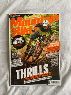
The last magazine I looked at was a cheaper magazine called 'mountain biking' the magazine had a lot more ads and overall east as good quality however there were techniques in this that I did not see in the others. Firstly the cover is a lot more cluttered which I am not a fan of and will make sure none of my pages for the photo story are as messy as this. Next I looked at a page with no bikes in, I like that you could use a combo of a portrait and a detail shot to tell the same story as if you took an image of the person on the bike. What I liked the next page was the technique of panning that was used, I like how this makes the background less distracting especially when the image will be covering the page you don't want it full of unnecessary messy detail. I also like how they include 'hell yeah' as I feel this adds to the thrill seeking nature of mountain biking. And lastly I looked at a page that had used a different technique to what I had seen previously, they used an image pasted into the text. This works really well for this page as the colours are all very harmonious and soft and this continues into the big heading that may have been distracting if it had been a block colour. I will try this out in my own work as I like how it ties the whole page together.


Comments